The Contact form section allows your store to easily connect with customers, gather feedback, and build trust. Adding a contact form not only improves customer support but also helps increase conversions by better understanding customer needs.

In this guide, you'll learn how to customize the Contact form section to match your brand and business goals.
You can open your page, click Add new section, and find the Contact Form section.

You can configure some general options for the Contact Form section below:
Color scheme: Allows you to select a color theme for the video section.
Success message: Sets the message displayed after a customer successfully submits the form. Leave this field blank to use the default success message.
Section padding
Top padding: Sets the space between the top of the video section and the element above it (in pixels).
Bottom padding: Sets the space between the bottom of the video section and the element below it (in pixels).
Mobile top padding: Sets the space between the top of the video section and the element above it (in pixels) on mobile devices.
Mobile bottom padding: Sets the space between the bottom of the video section and the element below it (in pixels) on mobile devices.

To add a Custom field block, click the Add block button (plus icon ➕) under the Contact Form section > In the Blocks tab, select Custom field.

You can configure some general options for the Custom field block below:
Label: The title or name shown for this input field. This is the label that customers will see on the form.
Type: You can choose the type for input field. Options included
+ Text: Allows you to enter freeform text.
+ Phone number: Lets you create a specifically field for phone number input.
+ Options: Lets you create a set of selectable choices (dropdown or radio buttons).
Required: Toggles whether this field is mandatory. When enabled, users must fill out this field to submit the form.
Text
Only applicable for input of type Text.
Text type: You can choose the display type for the text.
+ Short: A compact input field (suitable for name, email, etc.).
+ Long: A larger input field (used for comments, messages, etc.).
Maximum number of characters: Limits how many characters the user can type in this field.

Options
Only applicable for input of type options.
Option type: You can choose the display type for the option.
+ Drop-down select: Displays a dropdown list of options for the user to choose from.
+ Radio buttons: Displays all available options at once with circular selection buttons. The user simply needs to click on one item from the list.
Options: The list of selectable items. Each option must be placed on a separate line.

When a customer submits the contact form, the message is sent to your store’s Sender email address configured in Shopify Admin → Settings → Notifications → Sender email:
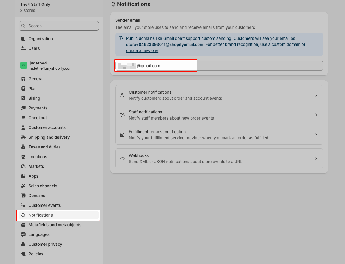
The submission does not go to a subscription/customer list like the Email signup form.