The Header inline is a flexible element designed to display a title and optionally a short description inline with its own content, rather than as a separate, full-width section.
Unlike the traditional Inline Header, the new version leverages theme blocks, offering greater flexibility and customization options for building diverse and dynamic menus.
The Header Inline (New) structure is organized into multiple content blocks, allowing flexible layout customization. It consists of:
Mega block: The Mega Block is a key component of the header that controls the content and layout of a mega menu. It supports multiple preset types, such as HTML, Shop, Product, Page, Blog, and more, allowing for flexible customization. Each Mega Block can be linked to a specific menu item in the main navigation and assigned a chosen Mega Menu Preset to display the desired content format.
Mega block column (10): The Mega Block Column (10) is a block within the Header Inline (New) section, consisting of child blocks called Column. It is designed to organize content in a structured, column-based layout. The column layout can be customized with flexible width ratios ranging from 1/10 to 10/10, allowing for precise control over spacing and content distribution.
Mega Block Column (12): The Mega Block Column (12) is similar to the Mega Block Column (10) in both structure and functionality. However, the key difference lies in its column layout configuration, which can be flexibly customized with width ratios ranging from 1/12 to 12/12, allowing for more precise and versatile content arrangement.
The following guide will help you understand its structure and how to customize the Header inline (New) effectively.
Step 01: From Shopify Admin, click on Online Store > Select Themes > In the Current theme section, click the Customize button.
Step 02: In the theme editor (Customize), click the Sections button > In the Header group tab, click Add section botton > Scroll through the list or use the search bar to find and select the Header inline section.
Follow this guide to easily create a mega menu.
We prioritize the top first section header to show. Please delete header sections that you do not use.
Header layout: Choose the layout for your header. Options include a logo left and logo center
Enable full Width: Check to enable full width for the header. When enabled, the header will stretch across the entire browser viewport
Main header min height: Set the minimum height of the header on desktop. This affects the vertical space the header occupies on the page.
Logo: Upload your logo image file. This is the primary visual identifier for your brand, typically appearing at the top of the page.
Logo width: Set the width of the logo (in pixels) for desktop viewing. This width will automatically adjust for mobile devices to ensure optimal display.
Colors schema: Select the color schema for the header. This schema will determine the header's background color and text color, ensuring color consistency across your website.
Main menu: Select the main navigation menu to be displayed on your website.
Enable Lazy menu?: Enable this option to lazy load the menu. This improves initial page load speed by only loading parts of the menu when they are needed
Improve page load speed
Main menu position: Select the position of the main menu within the header. Common options include center-aligned, left-aligned, or right-aligned.
Menu item size: Set the font size for the main menu items.
Menu item weight: Set the font weight for the main menu items.
Enable uppercase text: Enable this option to transform all menu item text to uppercase.
Show dropdown arrow: Display a dropdown arrow icon next to main menu items that have submenus. This arrow will always be shown on submenu items.
Item main menu has submenu will show dropdown arrow. Always show in submenu item
Spacing menu items: Set the horizontal spacing between main menu items.
Spacing between menu items
Open dropdown items on event: Select the event to open dropdown menu items (on hover or click).
Click mode is forced on touch devices.
Menu type: Select the type of menu to be used. Options include default menu (traditional dropdowns), sidebar menu (opens an off-canvas panel on click), or split menu (divides the menu into two sections).
Menu split only work with header layout 'logo center'
Color for submenu default: Select the default color for the background and text of submenus.
Group icons options. Only work on desktop
Enable search form: Choose the display style for the search form. Options include: Search hidden (icon only), short form (a compact input field), or big form (a prominent or full-screen search input).
Search type 'Big form' only works with header layout 'Logo left' and 'Menu sidebar'
Show user: Check to display the customer account icon or link in the header. This link will direct to the login page or the customer's account page if they are already logged in.
Show wishlist: Check to display the wishlist icon in the header. This feature allows customers to save products for later viewing or purchase.
Turn on wishlist in theme settings first
Enable header socials: Enable this option to display social media icons (e.g., Facebook, Instagram) in the website header.
Only works when 'Enable menu sidebar or menu split' and header layout 'Logo center'. Depending on the design to display the appropriate location.
Main header min height on mobile: Set the minimum height of the header on mobile devices. This ensures the header remains clearly visible and easy to interact with on smaller screens.
Logo mobile: Upload a separate logo image file specifically for mobile devices (optional). Use a logo optimized for smaller screens or a brand icon if desired.
Menu mobile: Select the navigation menu to be displayed when users access the website from a mobile device.
Enable header categories: Enable this option to display product categories directly in the header
Add menu categories: Select the list of collections or categories to be displayed when 'Enable header categories' is active.
Enable Lazy menu?: Enable this option to lazy load the menu on mobile devices. This improves initial page load speed by only loading parts of the menu when they are needed
Only click icon: When enabled, only clicking the arrow icon will expand a submenu; clicking the menu item text will navigate directly to the linked page.
Color menu mobile: Select the color schema for the mobile menu when it is open. This schema will determine its background color and text color, ensuring color consistency and readability.
Notice mobile: Enter a short notification text to be displayed at the top of the mobile menu
Enable header transparent: To show a transparent header, add a compatible section (such as slideshow, hero image, banner) as the first section.
Logo header transparent: Upload the logo image file that will display when the header is in transparent mode.
Colors schema: Select the color schema to be applied to this section. A color schema defines color variables such as background color, text color, button colors, and more,
Enable header sticky: Select the behavior of the sticky header when scrolling.
On scroll up: The header reappears only when the user scrolls upwards.
Always: The header remains fixed at the top of the page after scrolling down a certain distance.
None: The header does not stick (it scrolls out of view).
Enable glass sticky header: Enable this option to apply a "glassmorphism" effect to your sticky header.
Frosty glass effect for sticky header.
To add a Mega Block to the Header inline (New) section, click the Add block button (plus icon ➕) under the Header inline (New) section.
After adding the Mega Block, you can adjust its settings using the sidebar—located on the right or left side of your screen depending on your device
Menu item name (level 1) of main menu: Add title to connect menu item
Make sure the 'Menu item name (level 1) of main menu' is the same as 'menu title' in Navigation, including upper and lower case characters, spaces, etc...
Colors schema: Select the color schema to be applied to the background and text of the Mega Menu. A color schema defines color variables such as background color, text color, button colors, and more
Mega menu width: Select the width of the Mega Menu.
Full width: Stretches across the entire screen width.
Custom width: Allows you to set a specific width.
Submenu position: Select the position of the submenu (dropdown). This setting only applies when "Mega menu width" is set to "Custom width".
Default: Typically aligns directly under its parent menu item.
Center on screen: Centers the Mega Menu across the entire screen.
Mega menu custom width: Enter the custom width (in pixels) for the Mega Menu. This setting only applies when "Mega menu width" is set to "Custom width".
Mega Menu Presets: The Mega Menu Presets dropdown allows you to choose a predefined content layout for your mega menu. Each option determines the type of content that will be displayed within the menu block. Here’s what each preset means:HTML
Allows you to manually insert custom HTML content into the menu.
Content HTML: Enter custom HTML content to be displayed within this Mega Menu. This allows you to add complex elements such as videos, forms, or custom code.
Content page: Select an existing Shopify page to display its content within the Mega Menu. This facilitates easy reuse of existing content.
This page content will appear.
Blog post: Select the blog you want to display articles from.
Number of articles to show: Choose how many blog posts you want to display. You can adjust the slider or enter a number manually (e.g., 4).
Image ratio: Sets the aspect ratio for the blog images.
Landscape: A wider image layout, ideal for blog previews. Other possible options might include Square or Portrait depending on your theme.
Full image (toggle):
When turned on, the full-size blog image will be shown.
When off, the image may be cropped or resized to fit a specific layout.
Use navigation (toggle):
When turned on, navigation controls (like arrows or dots) will appear, allowing users to scroll through blog posts.
When off, all selected posts are displayed statically without navigation.
Use navigation: Toggles navigation links on or off.
Products list title: Sets the heading above the product list
Products list: Displays selected products in the menu
Image ratio: Defines the shape of the images in the menu. Options include is Adapt to image, Square, Portrait, ASOS, Landscape
Full image: When turned on, images will be shown at full height or width without padding.
Collection list: Shows the list of collections that will appear in the mega menu.
Collection colors: Allows you to choose a color scheme for the collection section.
Child Menu (often referred to as a submenu, dropdown menu, or nested menu) is a hierarchical navigation element that appears when a user interacts with a parent menu item. It serves to organize website content into logical, manageable groups,
To add a Mega Block Column (10) to the Header inline (New) section, click the Add block button (plus icon ➕) under the Header inline (New) section.
After adding the Mega Block Column (10), you can adjust its settings using the sidebar—located on the right or left side of your screen depending on your device
Menu item name (level 1) of main menu: Add title to connect menu item
Make sure the 'Menu item name (level 1) of main menu' is the same as 'menu title' in Navigation, including upper and lower case characters, spaces, etc...
Colors schema: Select the color schema to be applied to the background and text of the Mega Menu. A color schema defines color variables such as background color, text color, button colors, and more
Mega menu width: Select the width of the Mega Menu.
Full width: The menu stretches across the entire screen.
Container: The menu follows the site’s content container width.
Custom width: Allows you to set a specific width manually using the input below.
Submenu position: Select the position of the submenu (dropdown). This setting only applies when "Mega menu width" is set to "Custom width".
Default: Typically aligns directly under its parent menu item.
Center on screen: Centers the Mega Menu across the entire screen.
Mega menu custom width: Enter the custom width (in pixels) for the Mega Menu. This setting only applies when "Mega menu width" is set to "Custom width".
Spacing between items: Controls the horizontal spacing (padding or gap) between individual elements inside the mega menu (e.g., product blocks or collection cards).
Layout – Columns desktop:
This defines the column's width on desktop screens. eg: "5/10-50%" means the column takes up 50% of the available width.
Padding left/right: Sets the space between the content and the left/right edges of the column.
Padding top/bottom: Sets the space between the content and the top/bottom edges of the column.
Content width: Auto / Full
Auto: The content takes up only the space it needs.
Full: The content stretches to fill the entire width of the column.
Content position: This option lets you control the position of the content inside the column only when the Content width is set to Auto.
Alignment: Left / Center / Right
Aligns the content horizontally inside the column.
Background image: Allows you to choose a background image for the column.
Background color: Sets the background color of the column.
If both Background image and Background color are configured, the Background image will take priority and be displayed over the background color.
Within a Column block, you can flexibly add various child blocks such as Button, Banner item, Video (Media), Product carousel, and many more to customize your layout.
Since the Header inline section only applies to desktop view, you can ignore any settings related to tablet and mobile screens (if available) within these blocks.
Follow this guide to config Banner item block
2.3.1.2. Blockquote
Quote
This is the content area where you can enter and format the text of your quote. You can use basic text formatting options such as bold, italic, bullet points, and hyperlinks.
Text color
This dropdown lets you choose the color style for the quote text. The available options usually follow your theme's color settings:
Default – Uses the theme’s standard text color.
Secondary – Applies the secondary color defined in your theme.
Tertiary – Applies a third-tier color, often used for less prominent text.
Accent – Uses the accent color, typically reserved for highlights or callouts.
2.3.1.3. Button
Follow this guide to config Button block
2.3.1.4. Heading
Follow this guide to config Heading block
2.3.1.5. Liquid - HTML
Follow this guide to config Liquid-HTML block
2.3.1.6. Media
Follow this guide to config Media block
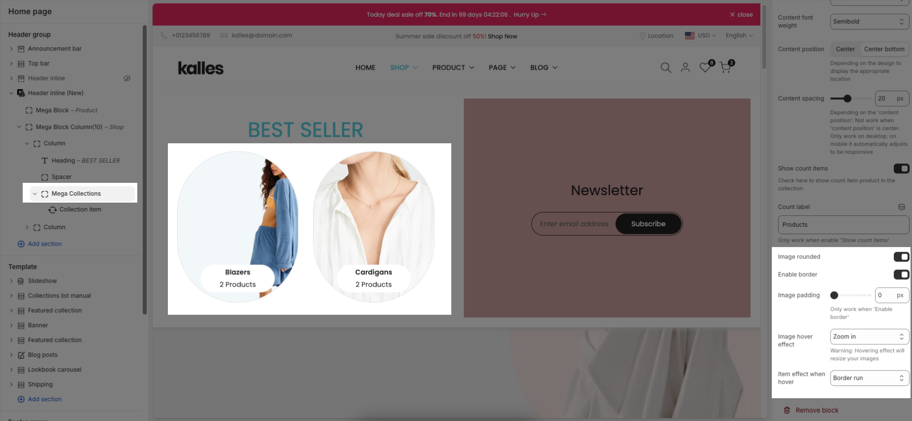
2.3.1.7. Mega Collections
Items per row (Desktop): Allows you to choose how many collection items are displayed in one row on desktop (from 2 to 6).
Select collection: Lets you choose which collections to display from your store
Image ratio: Sets the shape of the images — for example, Portrait, Square, Landscape, etc.
Full image: When enabled, the full image will be displayed. If turned off, the image may be cropped depending on the layout.
Collection design: Lets you choose the layout style for displaying collection items
Content font size: Sets the size of the text for the collection title and product count (e.g., Small, Medium, Large).
Content font weight: Controls the thickness of the text (e.g., Regular, Semibold, Bold).
Content position: Defines where the text appears relative to the image — options like Center or Center bottom.
Content spacing: Adds spacing between the image and the text.
Note: Only works when “Content position” is set to something other than “Center”.
Show count items: When enabled, shows how many products are in each collection.
Count label: Allows you to customize the label shown after the product count (e.g., “Products”).
Image rounded: When turned on, images will appear with rounded corners, typically as circles.
Enable border: Adds a border around the image. Must be enabled to use padding.
Image padding: Sets the space between the image and the border.
Only works when "Enable border" is active.
Image hover effect: Controls the animation for the image when hovered (e.g., Zoom in, Fade in, etc.).
Warning: Some effects may resize your images.
Item effect when hover: Sets an animation for the entire collection block on hover (e.g., Border run).
2.3.1.8. Mega Link List
Menu item name (level 1) of main menu: Add title to connect menu item
Make sure the 'Menu item name (level 1) of main menu' is the same as 'menu title' in Navigation, including upper and lower case characters, spaces, etc...
Linklist: Select the Menu to be displayed on your linklist
Note: You can only use one of the two options above at a time. Leave the other option blank if not in use.
2.3.1.9. Newsletter
Follow this guide to config Newsletter block
2.3.1.10. Product carousel
Follow this guide to config Product carousel block
2.3.1.11. Product Grid
Follow this guide to config Product Grid block
2.3.1.12. Spacer
Follow this guide to config Spacer block
2.3.1.13. Text
Follow this guide to config Text block
2.3.1.14. Video
Video height: Controls the height of the video on desktop.
Fixed height: Allows you to manually set a specific pixel height for the video on desktop (e.g. 860px).
Only works when "Video height" is set to "Fixed height".
Mobile video height: Controls how the video behaves on mobile view.
Mobile fixed height: Lets you define a fixed height (in px) for the video when viewed on mobile devices (e.g. 300px).
Video (Upload): This is the MP4 video file uploaded directly to your site.
Recommended for best performance and branding, especially for autoplaying without platform logos.
Video URL: Allows you to embed a video from YouTube or Vimeo by pasting the link here.
If both a file and URL are provided, the uploaded MP4 will be used.
Show video controls: When enabled, playback controls (like pause/play) will appear on the video.
Only applies to MP4 uploads. Note: when controls are shown, the video will not loop.
To add a Mega Block Column (12) to the Header inline (New) section, click the Add block button (plus icon ➕) under the Header inline (New) section.
After adding the Mega Block Column (12), you can adjust its settings using the sidebar—located on the right or left side of your screen depending on your device
Menu item name (level 1) of main menu: Add title to connect menu item
Make sure the 'Menu item name (level 1) of main menu' is the same as 'menu title' in Navigation, including upper and lower case characters, spaces, etc...
Colors schema: Select the color schema to be applied to the background and text of the Mega Menu. A color schema defines color variables such as background color, text color, button colors, and more
Mega menu width: Select the width of the Mega Menu.
Full width: The menu stretches across the entire screen.
Container: The menu follows the site’s content container width.
Custom width: Allows you to set a specific width manually using the input below.
Submenu position: Select the position of the submenu (dropdown). This setting only applies when "Mega menu width" is set to "Custom width".
Default: Typically aligns directly under its parent menu item.
Center on screen: Centers the Mega Menu across the entire screen.
Mega menu custom width: Enter the custom width (in pixels) for the Mega Menu. This setting only applies when "Mega menu width" is set to "Custom width".
Spacing between items: Controls the horizontal spacing (padding or gap) between individual elements inside the mega menu (e.g., product blocks or collection cards).
The structure of Mega Block Column (12) is similar to Mega Block Column (10), so you can refer to the customization instructions in section 2.3 above.