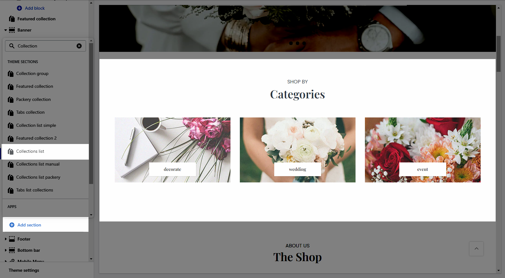
This section allows you to show a list of collections with many designs. However, Shopify 2.0 allows you to add the Collections list to any pages that you want.
From Theme sections > Add section > Collection List
Heading design: There are a total of 14 heading designs.
Heading align: Align the title to the left, center.
Heading: Enter the content of the heading.
Enter a icon name on the heading: Go to LineAwesome to get the icon that you want to show on the design 6.
Subheading: Enter the content of the subheading.
Space bottom (px): This allows you to change the space between the heading and content.
Please follow this video below for details:
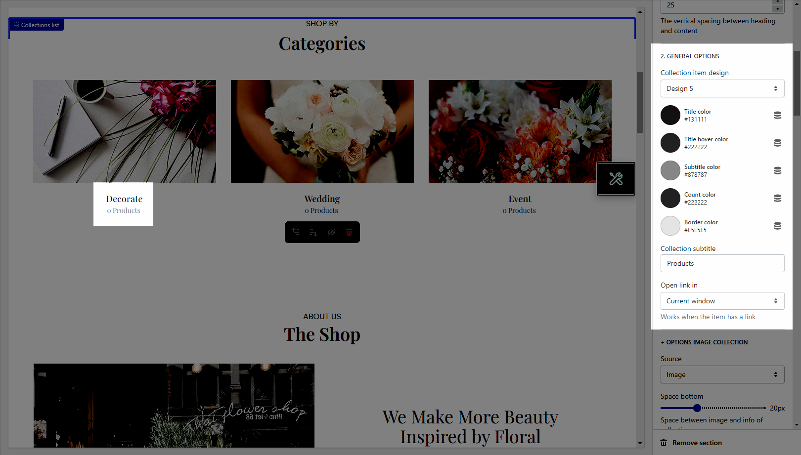
Collection item design: There are totally 13 heading designs.
It helps you configure the title of collection item with options for Title color, Title hover color, Subtitle color, Count color, Border color.
Collection subtitle: Enter the content of the sub title.
Open link in: This option allows you to set the link to open in the current window or a new window when a customer clicks on the button.
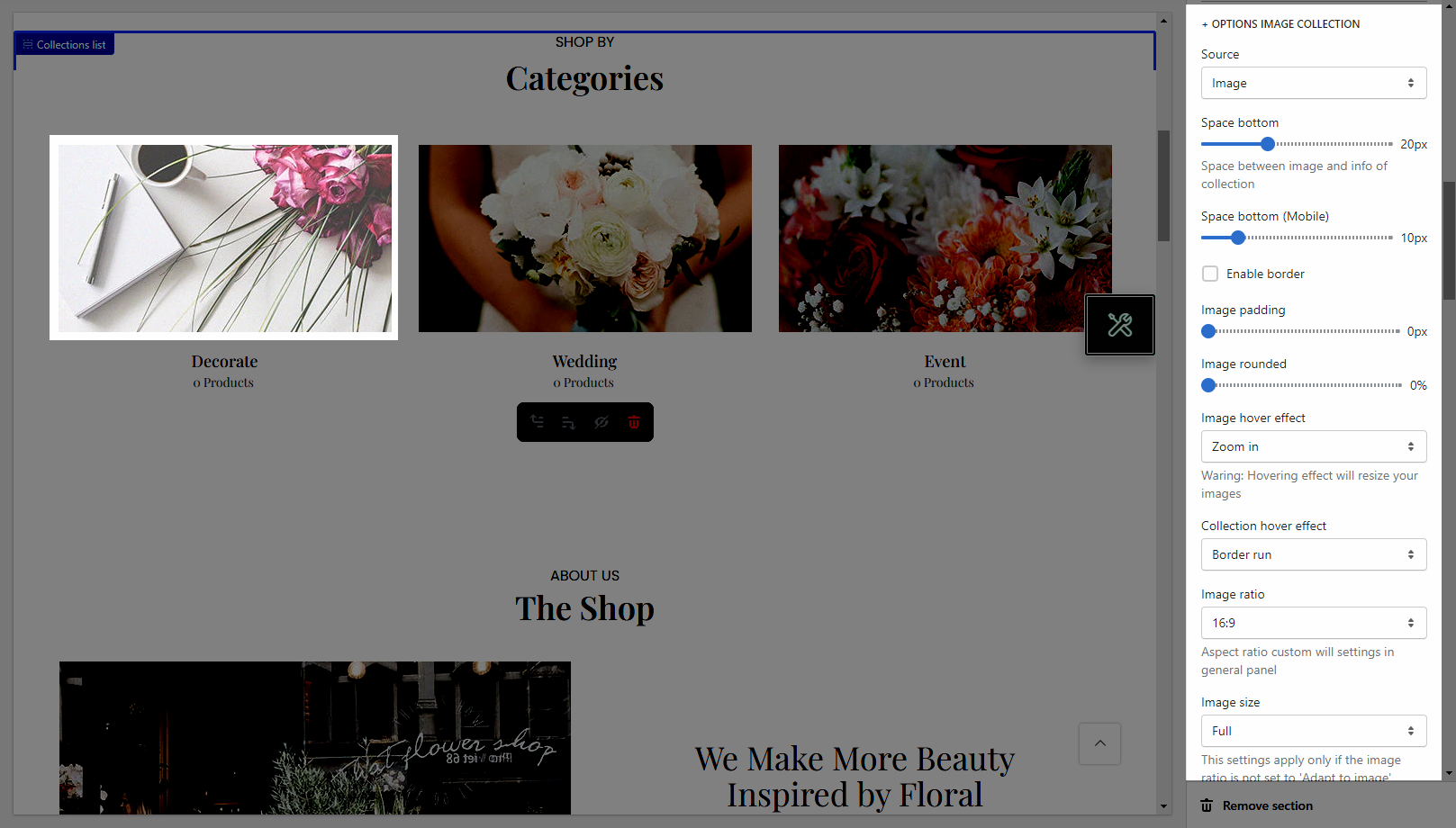
Source: The Source option allows you to choose to show the collection item from Image or Icon.
It helps you configure the image collections with options for Space bottom(both on desktop & mobile), Image padding, Image rounded, Image hover effect, Collection hover effect, Image ratio, Image size, and Image position.
Layout design: You can choose between Grid and Slider.
It helps you configure the image products with options for Items per row(both on desktop, tablet & mobile), Space horizontal items(both on desktop and mobile), Space vertical items(both on desktop & mobile)
Please follow this video below for details:
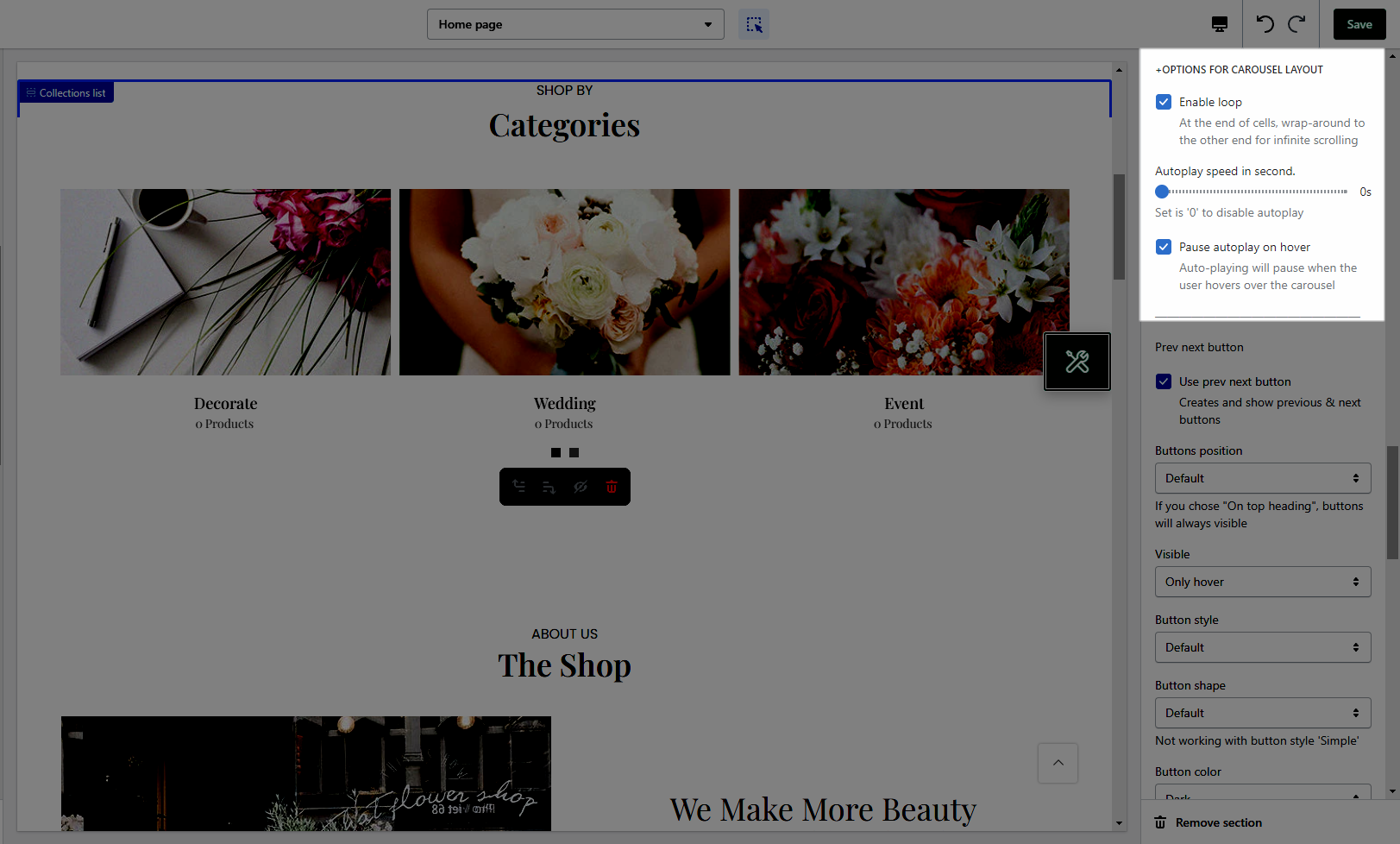
Enable loop: At the end of cells, wrap around to the other end for infinite scrolling.
Autoplay speed in seconds: You can set the automatic time to move on to the next collection item. Set is ‘0’ to disable auto-play.
Pause autoplay on hover: Auto-playing will pause when the user hovers over the collection list
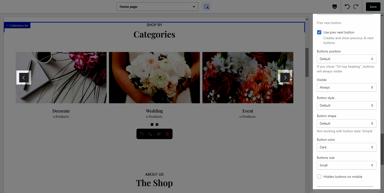
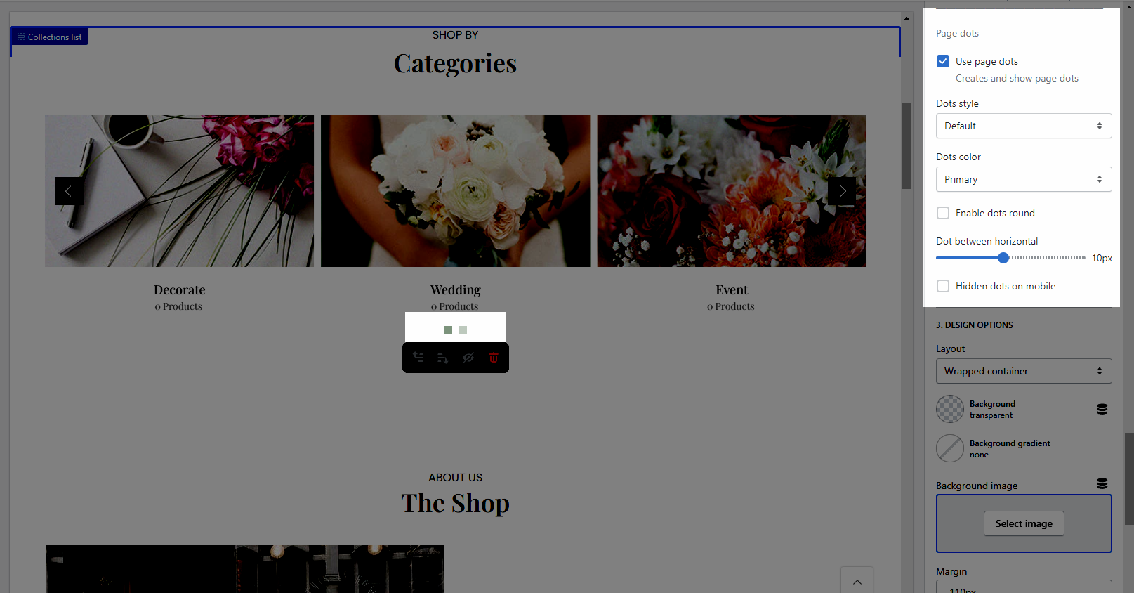
Moreover, you are allowed to adjust the Prev next button and Page dots
Please follow this guideline to config Layout, Background, Margin/Padding for the section.
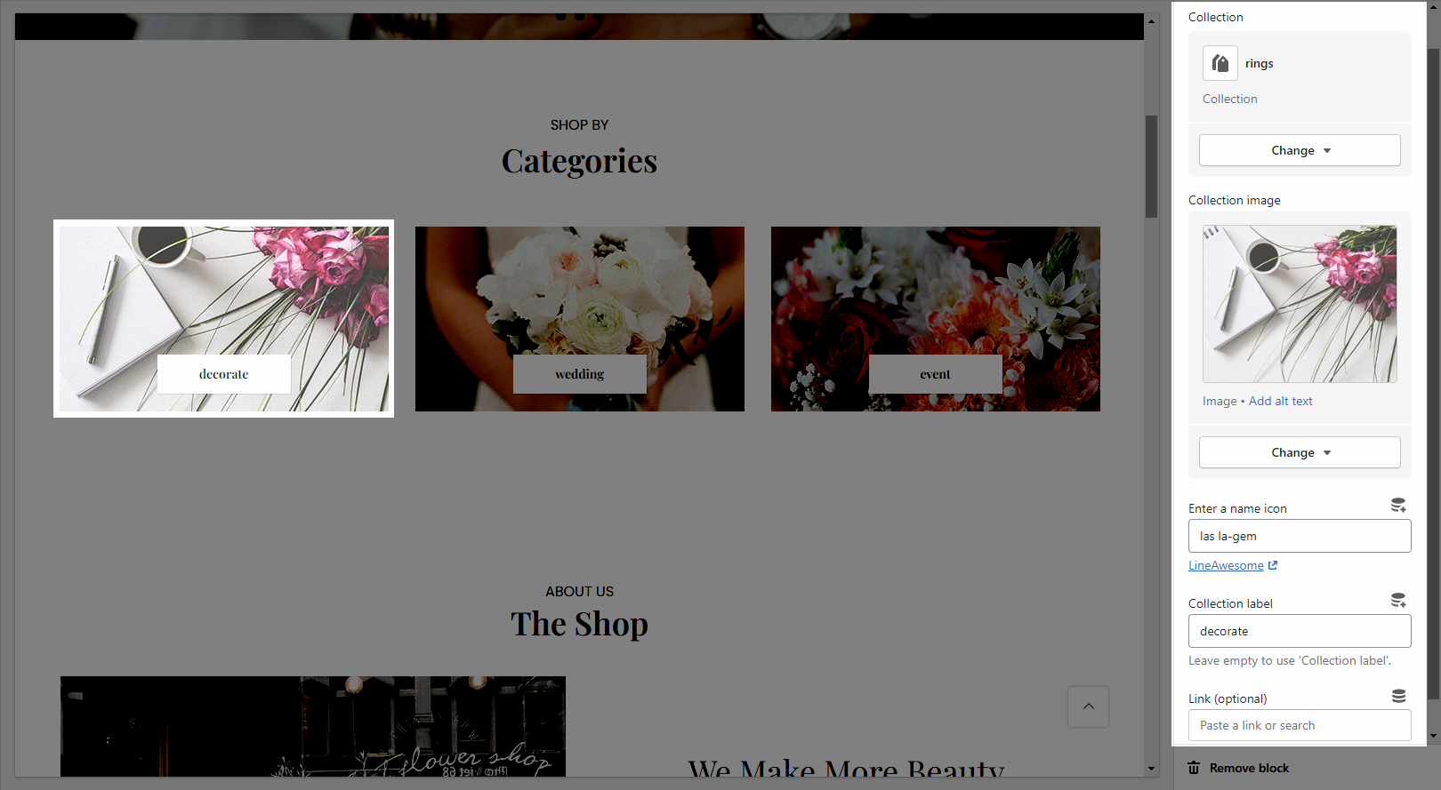
Collection: Select a collection that you want to show on the collection item.
Collection image: It allows you to upload an image for the collection item. This only works if you select the Image source from OPTIONS IMAGE COLLECTION in Settings.
Enter a name icon: Go to LineAwesome to get the icon that you want to show. This only works if you select the Icon source from OPTIONS IMAGE COLLECTION in Settings.
Collection label: Enter the content of the label.
Link (optional): Input the link for the collection item.