Banner sections help you showcase promotions, featured collections, products, videos, and marketing campaigns using flexible layouts and content blocks.
The theme supports the following banner sections:
Banner
Banner Masonry
Banner Parallax
Banner Video
Many settings are shared across Banner sections. Understanding these settings will help you configure any banner section more efficiently.
These settings control how banner items are displayed.
Layout Type – Display items in a Grid or Carousel layout.
Columns – Define the number of items displayed per row.
Spacing Between Items – Control the gap between banner items.
Scroll Snap Slider on Mobile – Convert banner items into a swipeable slider on mobile devices.
These settings control the placement of content inside banner items.
Content Position Type – Choose between Container and Custom positioning.
Content Position – Define where content appears within the banner.
Text Alignment – Align content left, center, or right.
Row Gap – Control vertical spacing between content blocks.
Column Gap – Control horizontal spacing between content blocks.
These settings customize the appearance of banner sections and items.
Color Scheme – Apply predefined color styles.
Background Image – Add a background image to the section.
Overlay – Add a color overlay above the image.
Content Background – Display a background behind content for better readability.
Display Colors by Section – Apply custom colors to an entire section.
Display Colors by Block – Apply custom colors to individual blocks.
Margin and Padding settings are available throughout all Banner sections and can be used to adjust spacing around and inside the section.
Most Banner sections support the following content blocks:
Heading
Text
Button
Custom Button
Image
Product Info
Group
Divide
Spacer
Liquid / HTML
Custom Text
The Banner section displays multiple banner items in either a grid or carousel layout.
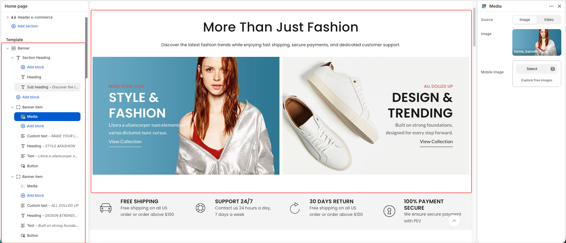
Image Height
Mobile Image Height
Banner URL
Open in New Tab
Image Hover Effect
Item Hover Effect
Media
Heading
Text
Button
Product Info
Image
Group
Divide
Spacer
Liquid / HTML
Custom
Custom Button
Custom Text
Banner Masonry displays banner items with different widths and heights, creating a dynamic masonry-style layout.
In addition to the common settings, Banner Masonry includes:
Item Height
Mobile Item Height
Column Width
Row Count
Content Padding
These settings allow individual items to occupy different sizes within the masonry layout.
Banner Masonry supports the same content blocks as the standard Banner section.
Banner Parallax displays a large banner image with a parallax scrolling effect, creating a sense of depth and movement as visitors scroll through the page.
Desktop Image
Mobile Image
Link URL
Open in New Tab
Min Height
Mobile Min Height
Parallax Animation
Heading
Text
Button
Button Group
Countdown
Spacer
Custom
Custom Button
Custom Text
For the best parallax experience:
Use high-resolution images.
Use images taller than the visible banner area.
Leave additional vertical space above and below the main content area.
Avoid placing important content too close to image edges.
Images with limited height may reduce the visual impact of the parallax effect.
Banner Video allows you to use videos instead of static images to create more engaging promotional content.
The Media block supports the following sources:
Uploaded Video
YouTube
Vimeo
For the best performance and loading speed, we recommend uploading video files directly to Shopify whenever possible. Directly hosted videos typically load faster and provide a smoother playback experience than external video sources.
Banner Video supports the same content blocks as the standard Banner section.