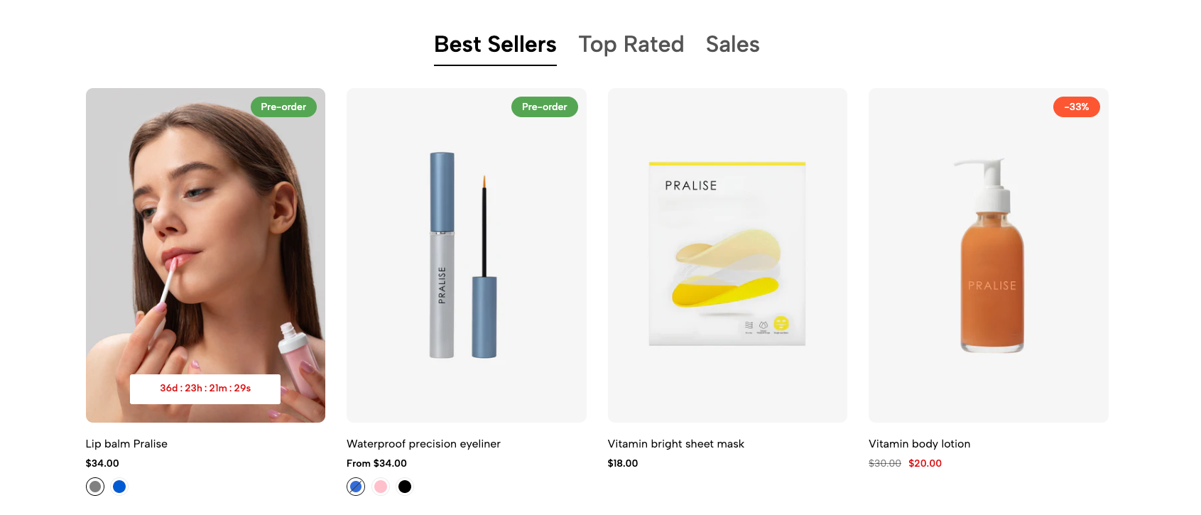
Displays products from multiple collections in a tabbed grid. Customers can switch between product groups without leaving the section.
Homepage
Collection landing page
Featured categories
New arrivals, best sellers, or sale products
Shopify Admin → Online Store → Themes → Customize → Add section → Tabs collections grid
Tabs item: Creates a tab using a collection or manually selected products.
Item link: Adds a custom link to the tabs list, if supported.
Setting | Description |
|---|---|
Item title | Sets the tab name. |
Select collection | Displays products from a selected collection. |
Products list | Manually selects products and overrides the collection. |
Setting | Description |
|---|---|
Tabs heading | Adds the main section heading. |
Heading size | Controls the heading size. |
Enable tabs heading inline | Places the heading and tab list on the same row. |
Tabs design | Selects the tab display style. |
Content font size | Controls tab-label size. |
Content font weight | Controls tab-label thickness. |
Enable uppercase text | Displays tab labels in uppercase. |
Tab item border width | Controls the tab border or underline thickness. |
Spacing between tabs item | Adjusts spacing between tabs. |
Setting | Description |
|---|---|
Product design | Selects the product-card style. |
Image ratio | Sets the product-image ratio. |
Full image | Displays the full image without cropping. |
Show vendor | Displays the product vendor. |
Products border | Controls product-card borders. |
Maximum items to show per page | Limits the number of displayed products. |
Items per row | Sets columns for desktop, tablet, and mobile. |
Setting | Description |
|---|---|
Pagination type | Selects how customers access additional products. Pagination is unavailable when using a manual product list. |
Pagination position | Aligns the pagination control to the left, center, or right. |
Distance between pagination and product items | Adjusts the spacing between the product grid and pagination. |
Button label | Sets custom text for the pagination button. |
Button style | Selects Solid, Outline, or Link style. |
Button font weight | Controls the thickness of the button text. |
Setting | Description |
|---|---|
Enable section full width | Expands the section across the full browser width. |
Color scheme | Applies a predefined color scheme to the section. |
Use short and clear tab names.
Keep the number of tabs limited.
Use the same product-image ratio across all tabs.
Recommended layout: 4 items on desktop, 2 on tablet, and 1–2 on mobile.
Use collections instead of manual product lists when pagination is needed.
Issue | Solution |
|---|---|
Products are not showing | Select a collection or product list for the tab. |
Collection products are ignored | Remove the manually selected product list. |
Pagination is not working | Use a collection instead of a manual product list. |
Tabs look crowded on mobile | Reduce the number of tabs or shorten tab names. |
Product grid is inconsistent | Use the same image ratio and product design for all tabs. |