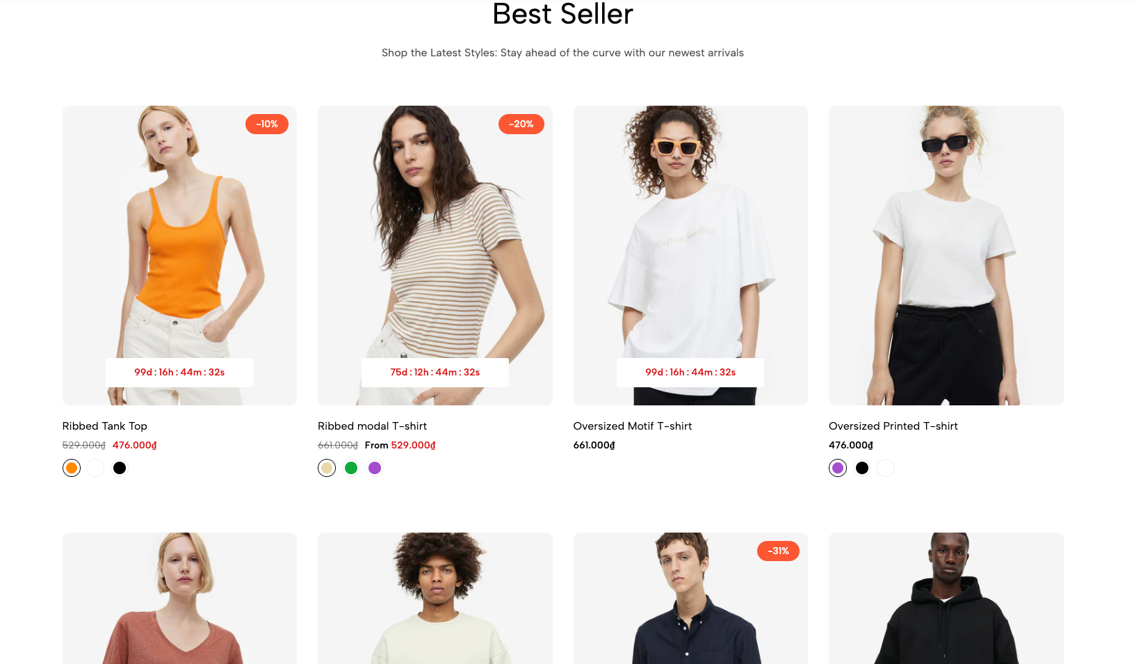
Displays selected products in a grid, helping customers browse and compare featured items quickly.
Homepage
Featured collection
New arrivals
Best sellers
Sale products
Collection landing page
Shopify Admin → Online Store → Themes → Customize → Add section → Featured collection grid
Section heading: Adds a title and supporting text.
Load more: Adds a button to reveal additional products.
Setting | Description |
|---|---|
Select collection | Displays products from a selected collection. |
Products list | Manually selects products and overrides the collection. |
Product design | Selects the product-card style. |
Image ratio | Sets the product-image proportion. |
Full image | Displays the complete image without cropping. |
Show vendor | Displays the product vendor. |
Products border | Controls borders around product images or cards. |
Setting | Description |
|---|---|
Maximum items to show per page | Limits the number of products initially displayed. |
Items per row | Sets columns on desktop, tablet, and mobile. |
Setting | Description |
|---|---|
Text alignment | Aligns the heading left, center, or right. |
Spacing between items | Adjusts spacing between heading blocks. |
Margin bottom | Sets the space below the heading. |
The heading supports responsive Heading and Text blocks with custom size, color, weight, and mobile visibility.
Setting | Description |
|---|---|
Pagination position | Aligns the button left, center, or right. |
Distance from product items | Sets the space above the button. |
Button label | Adds custom button text. |
Button style | Selects Solid, Outline, or Link. |
Size | Controls the button size. |
Button font weight | Controls button-text thickness. |
Setting | Description |
|---|---|
Enable section full width | Expands the section across the browser width. |
Bound full width | Keeps content within a centered container when full width is enabled. |
Color scheme | Controls the section colors. |
Section padding | Adjusts spacing above and below the section. |
Rate padding (mobile) | Controls responsive spacing on mobile. |
Custom CSS | Adds styles to this section only. |
Product cards may also use global Theme settings for:
Wishlist and comparison
Quick add and quick view
Product badges
Ratings
Product titles and prices
Color and size swatches
Secondary images
Configure these under Theme settings rather than repeating them in this section.
Use consistent product-image ratios.
Display four products per row on desktop and two on mobile.
Keep the initial product count manageable.
Use Load more for larger collections.
Use a manual product list only for carefully curated selections.
Keep the heading short and relevant.
Issue | Solution |
|---|---|
Products are not showing | Select a collection or add products manually. |
Selected collection is ignored | Remove the manually selected Products list. |
Load more button is missing | Add and configure the Load more block. |
Product images look cropped | Use Adapt to image or enable Full image. |
Ratings are missing | Install and configure a supported rating app. |
Mobile layout looks crowded | Reduce the number of items per row. |