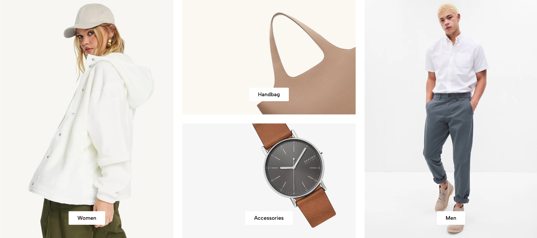
Displays manually selected collections in a customizable image layout. Suitable for featured categories, seasonal collections, or curated navigation on the homepage.
Homepage
Collection landing page
Featured categories
Seasonal campaigns
Brand or product-category navigation
Shopify Admin → Online Store → Themes → Customize → Add section → Collection list manual
Item: Adds a collection with a custom image, title, link, and responsive layout.
Section heading: Adds a heading and supporting text above the collection list.
Setting | Description |
|---|---|
Collection | Selects the collection to display. |
Collection image | Adds a custom image. Leave blank to use the collection image. |
Collection title | Adds a custom title. Leave blank to use the collection title. |
Collection link | Overrides the default collection URL. |
Collection design | Selects the collection-item style. |
Content font size | Controls the collection-title size. |
Content font weight | Controls the collection-title thickness. |
Enable uppercase text | Displays the title in uppercase. |
Content position | Positions the title over the image. |
Content padding | Adjusts spacing between the title and image edges on desktop. |
Setting | Description |
|---|---|
Column width | Sets the item width on desktop, tablet, and mobile. |
Row count | Sets how many rows the item occupies on each device. |
These settings allow different collection items to use different sizes within the same layout.
Setting | Description |
|---|---|
Row height | Sets image-row height on desktop, tablet, and mobile. |
Spacing between items | Controls gaps between collection items on each device. |
Setting | Description |
|---|---|
Text alignment | Aligns the heading content. |
Spacing between items | Adjusts spacing between heading blocks. |
Margin bottom | Sets the space below the heading. |
The heading supports Heading and Text blocks with responsive size, color, visibility, font weight, and letter-spacing settings.
Setting | Description |
|---|---|
Enable section full width | Expands the section across the browser width. |
Boxed full width | Keeps content inside a centered container while using a full-width background. |
Background image | Adds a section background image. |
Color scheme | Controls the section colors. |
Section padding | Adjusts spacing above and below the section. |
Rate padding (mobile) | Controls responsive spacing on mobile. |
Custom CSS | Adds custom styles to this section only. |
Use collection images with consistent quality and style.
Keep collection titles short.
Use custom links only when the item should lead somewhere other than the selected collection.
Plan column widths and row counts together to avoid empty spaces.
Check each layout separately on desktop, tablet, and mobile.
Keep text away from important image details.
Issue | Solution |
|---|---|
Collection image is not showing | Add a custom image or set an image for the selected collection. |
Collection title is incorrect | Remove the custom title to use the default collection title. |
Item opens the wrong page | Remove or correct the custom Collection link. |
Layout has empty spaces | Review column widths and row counts for each item. |
Content padding is not working | Select a non-centered content position and check the desktop view. |
Mobile layout looks uneven | Adjust mobile column width, row count, and row height. |