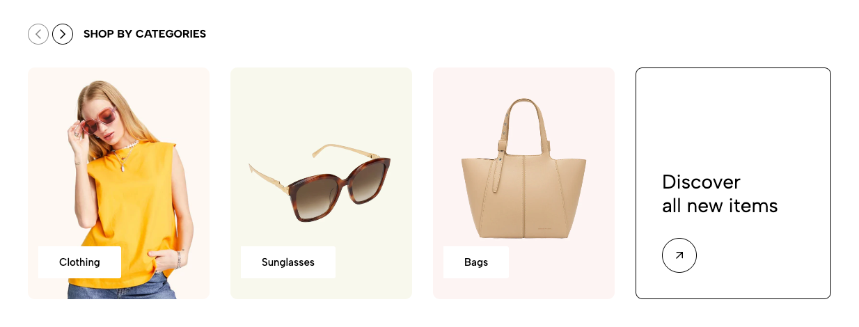
Displays multiple collections in a grid or slider layout. Suitable for category navigation, featured collections, and seasonal campaigns.
Homepage
Collection landing page
Shop-by-category section
Featured collections
Seasonal campaigns
Shopify Admin → Online Store → Themes → Customize → Add section → Collection list
Collection item: Adds an individual collection with a custom image, title, and link.
Items View All: Adds a link item leading to another page or the full collection list.
Setting | Description |
|---|---|
Collection | Selects the collection to display. |
Collection image | Adds a custom image. Leave blank to use the collection image. |
Collection title | Adds a custom title. Leave blank to use the collection title. |
Collection link | Overrides the default collection URL. |
Setting | Description |
|---|---|
Title item | Sets the displayed text for the View All item. |
Link | Sets the destination URL. |
Controls the section heading, subheading, alignment, typography, and spacing.
Setting | Description |
|---|---|
Select collection list | Selects collections directly. If empty, collections from blocks are used. |
Collection design | Selects the collection-card style. |
Content font size and weight | Controls collection-title typography. |
Enable uppercase text | Displays collection titles in uppercase. |
Content position | Positions text within each collection item. |
Content padding | Adjusts content spacing on desktop when text is not centered. |
Image ratio | Sets the collection-image ratio. |
Full image | Displays the complete image without cropping. |
Items per row | Sets columns on desktop, tablet, and mobile. |
Spacing between items | Controls gaps between collection items. |
Enable half item | Displays part of the next item to indicate horizontal scrolling. |
Setting | Description |
|---|---|
Use prev/next button | Displays slider navigation arrows. |
Navigation design | Selects the arrow style. |
Navigation position | Positions the arrows inside or outside the content. |
Use dots | Displays pagination dots. |
Dots position | Sets the location of pagination dots. |
Setting | Description |
|---|---|
Enable section full width | Expands the section across the browser width. |
Boxed full width | Keeps content inside a centered container with a full-width background. |
Color scheme | Controls the section colors. |
Section padding | Adjusts spacing above and below the section. |
Rate padding (mobile) | Controls responsive spacing on mobile. |
Use collection images with consistent ratios.
Keep collection titles short.
Use four items per row on desktop and two on mobile.
Enable Half item to make horizontal scrolling more noticeable.
Use the View All item only when customers need access to more categories.
Avoid mixing different collection designs in nearby sections.
Issue | Solution |
|---|---|
Collections are not showing | Select a collection list or add Collection item blocks. |
Custom image is not displayed | Check whether the image was added to the correct block. |
Collection opens the wrong page | Remove or correct the custom Collection link. |
Content padding is not working | Select a non-centered content position and check desktop view. |
Slider arrows are missing | Enable prev/next buttons and review navigation settings. |
Mobile layout looks crowded | Reduce items per row or enable horizontal scrolling. |