With Layout settings, you can set your Site width, Grid spacing, Rounding.
From Theme Settings -> Layout
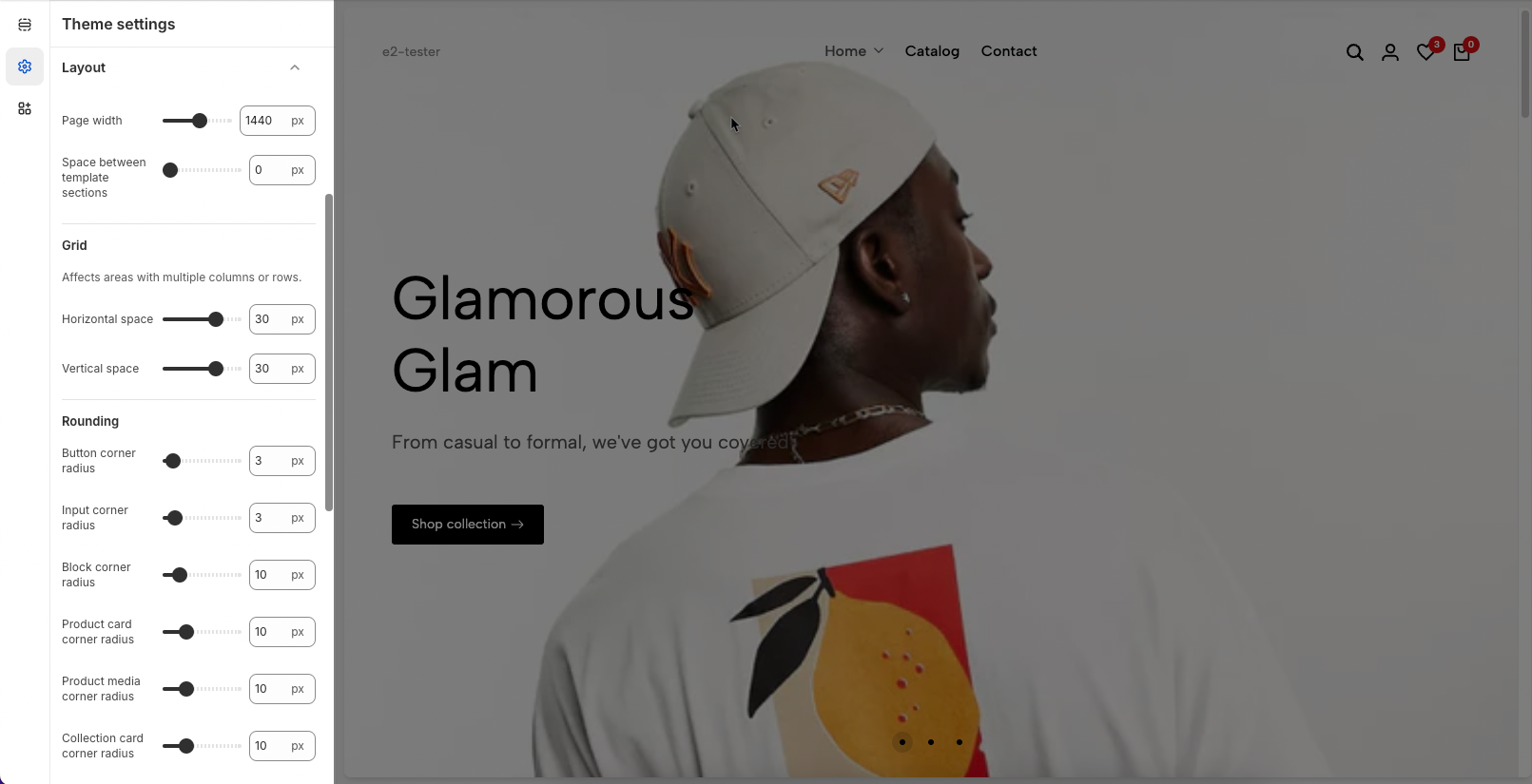
Page width: Allows you to set the maximum width that your online store will display in. This option will apply to all sections on the theme (except for sections that contain the option enable Fullwidth)
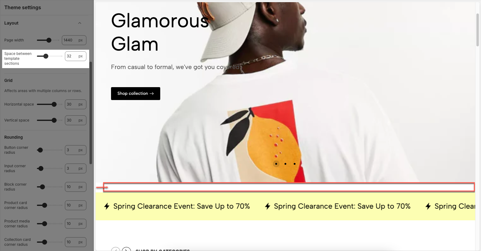
Space between template sections: You can adjust space between sections.
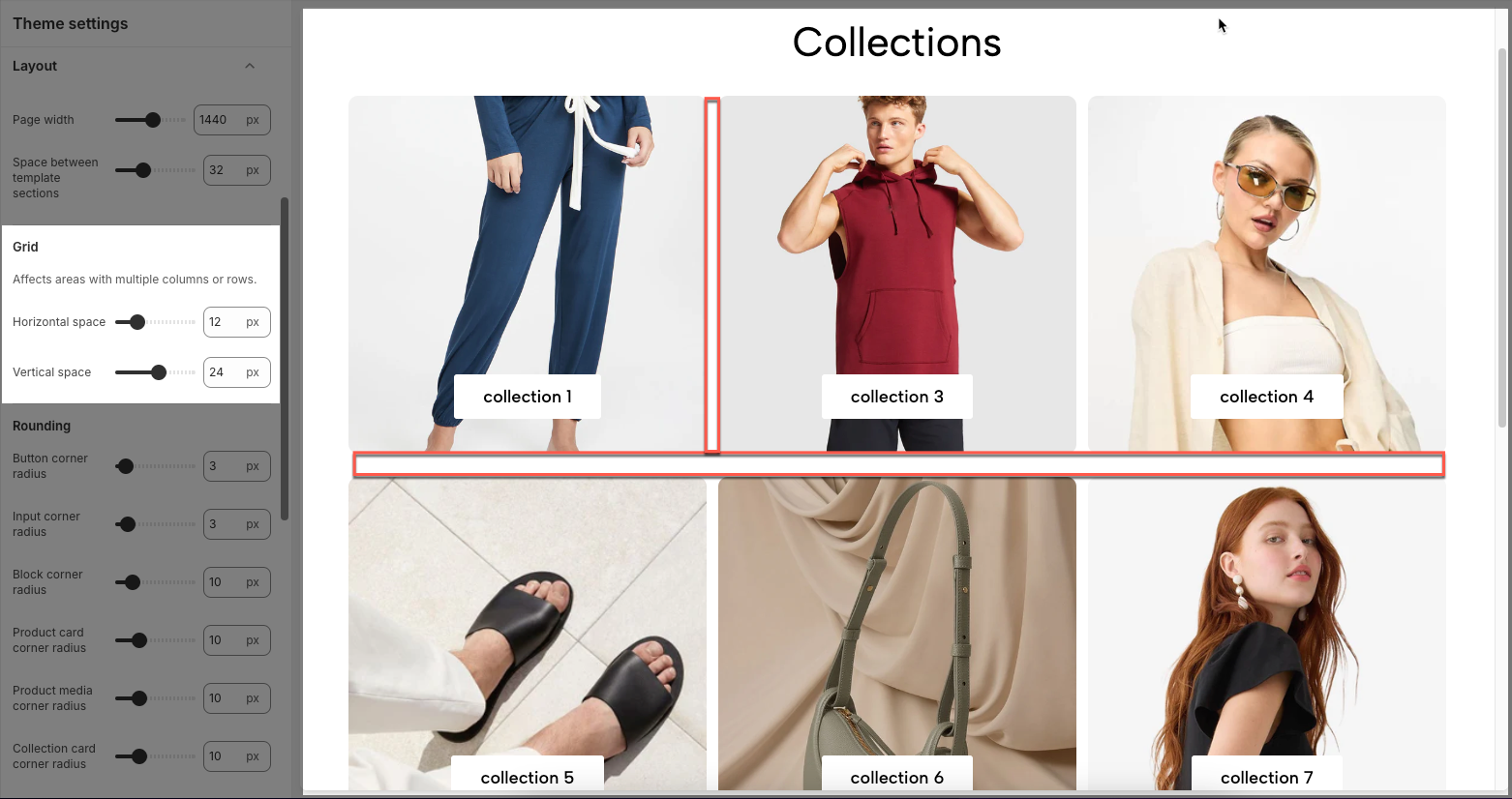
This settings affect areas with multiple columns or rows.
You can adjust the rounding for blocks, buttons, input field, ...
Controls how the sidebar is displayed based on the section layout structure.
Container: Both the section and content stay within the main content width.
Wrapper Container: The section stretches full width, while the content remains within the main content width.
Full Width: Both the section and content stretch across the full screen width.
Sidebar behavior:
If there are no Full Width sections, the sidebar spans the entire page content area.
If a Full Width section appears at the top of the page, the sidebar starts below that section.
If multiple Full Width sections separate content areas, the sidebar is displayed only within the content area between those Full Width sections.
The sidebar never overlaps Full Width sections.
Note: Available on desktop screens larger than 1150px only.